Over more than 10 years, the focus of this project changed often.
The overall focus was to sell all units. But first the idea had to be accepted by the municipality and the nearby residents. This required a web site and direct mail campaign. Eventually, everything was approved.
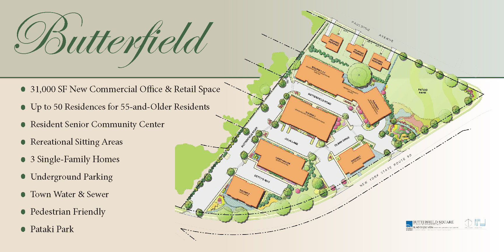
The next focus was to build a "personality" for the development, including a logo. As the building site was developed with residential and commercial offerings, we created several web sites (initial offering, introductory sales, ongoing sales, final closure), marketing material, all signage on the property, floor plans, and products for the sales team.
Once the units were available for purchase, they sold out in less than 18 months.
•••
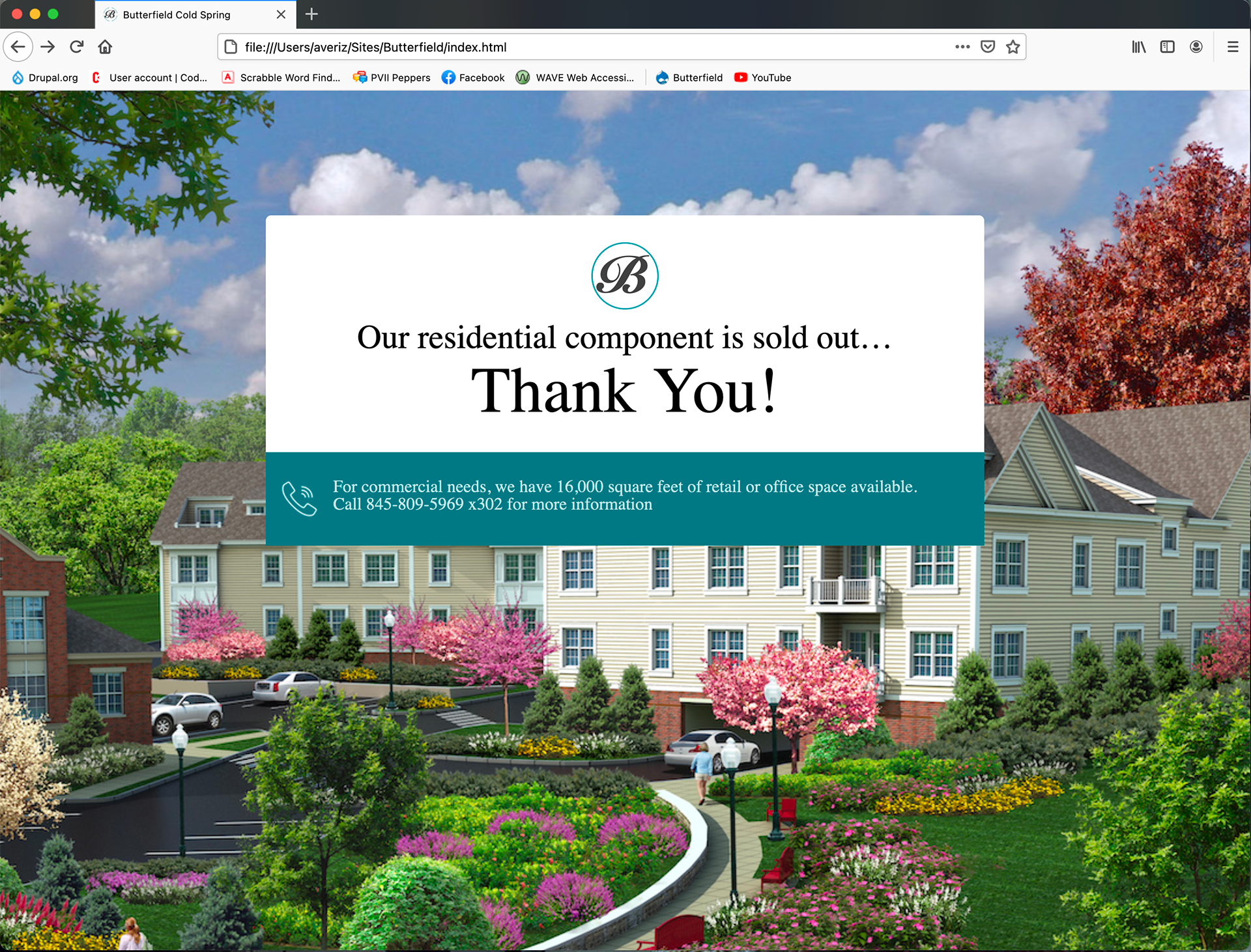
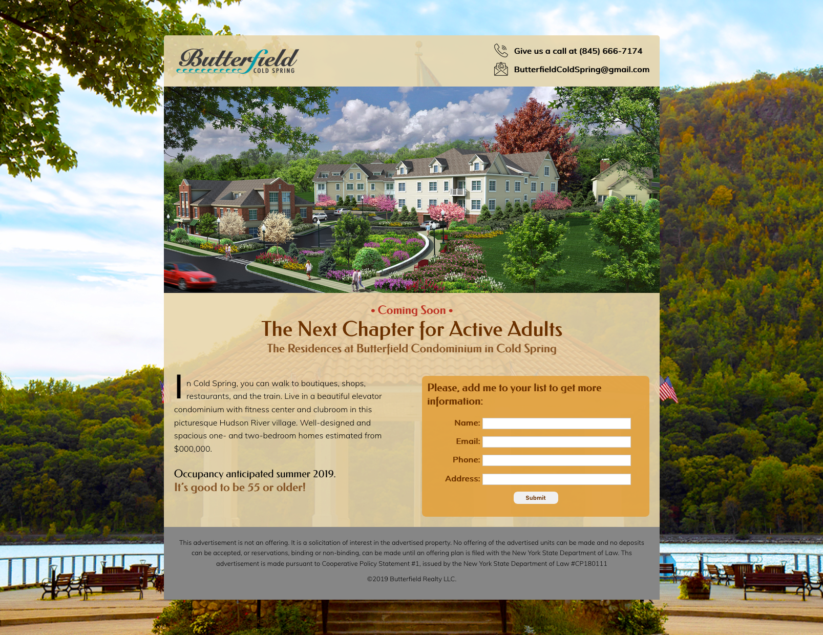
Below: The home page of the site designed when renderings became available and units were beginning to be sold.

Once all residential units were sold, the developer pulled the site down and offered thanks while reminding visitors that commercial space was still available.
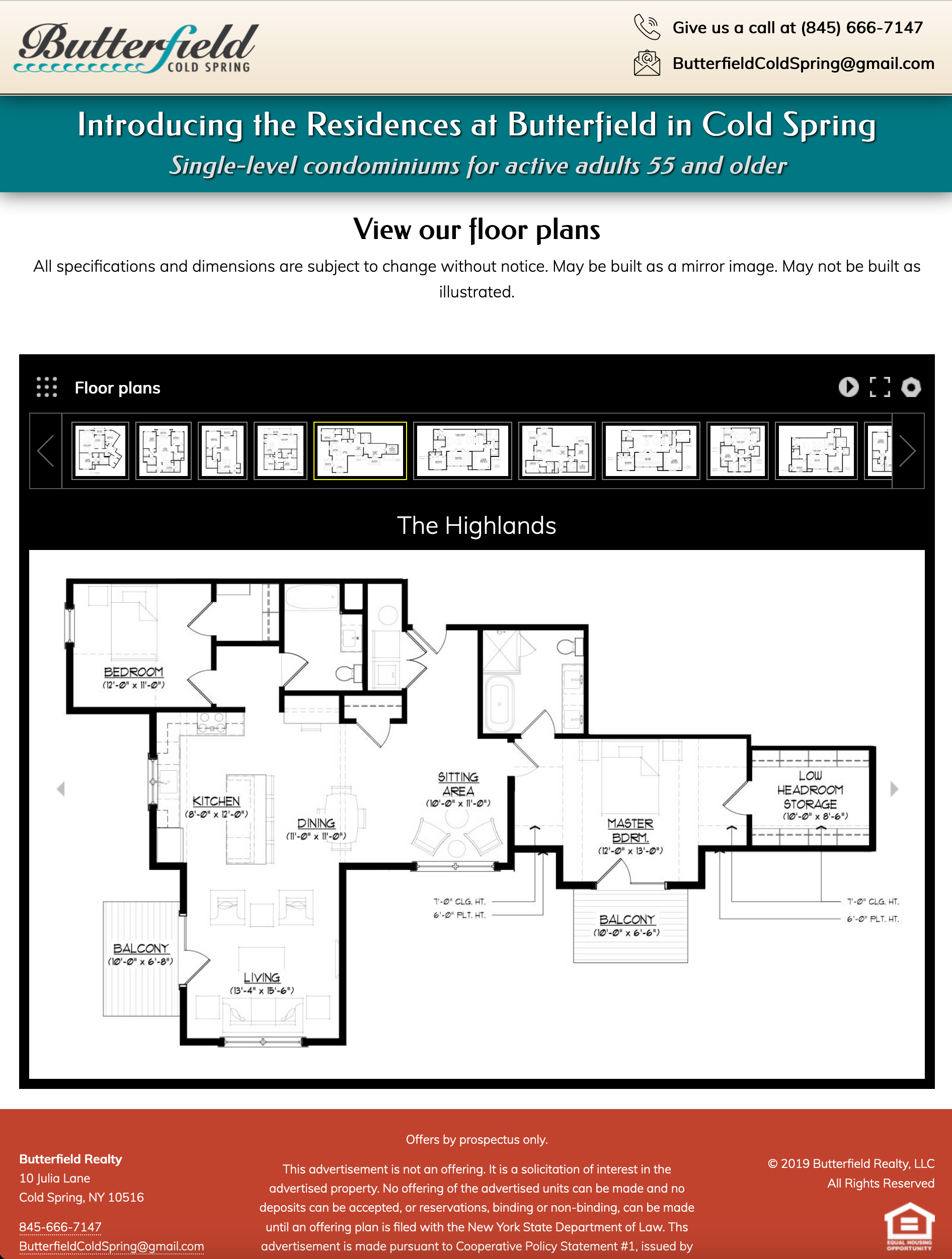
Below top left: This internal page allowed site visitors to scroll through the various floor plans of different units in the buildings. Details of each unit were under a menu click.
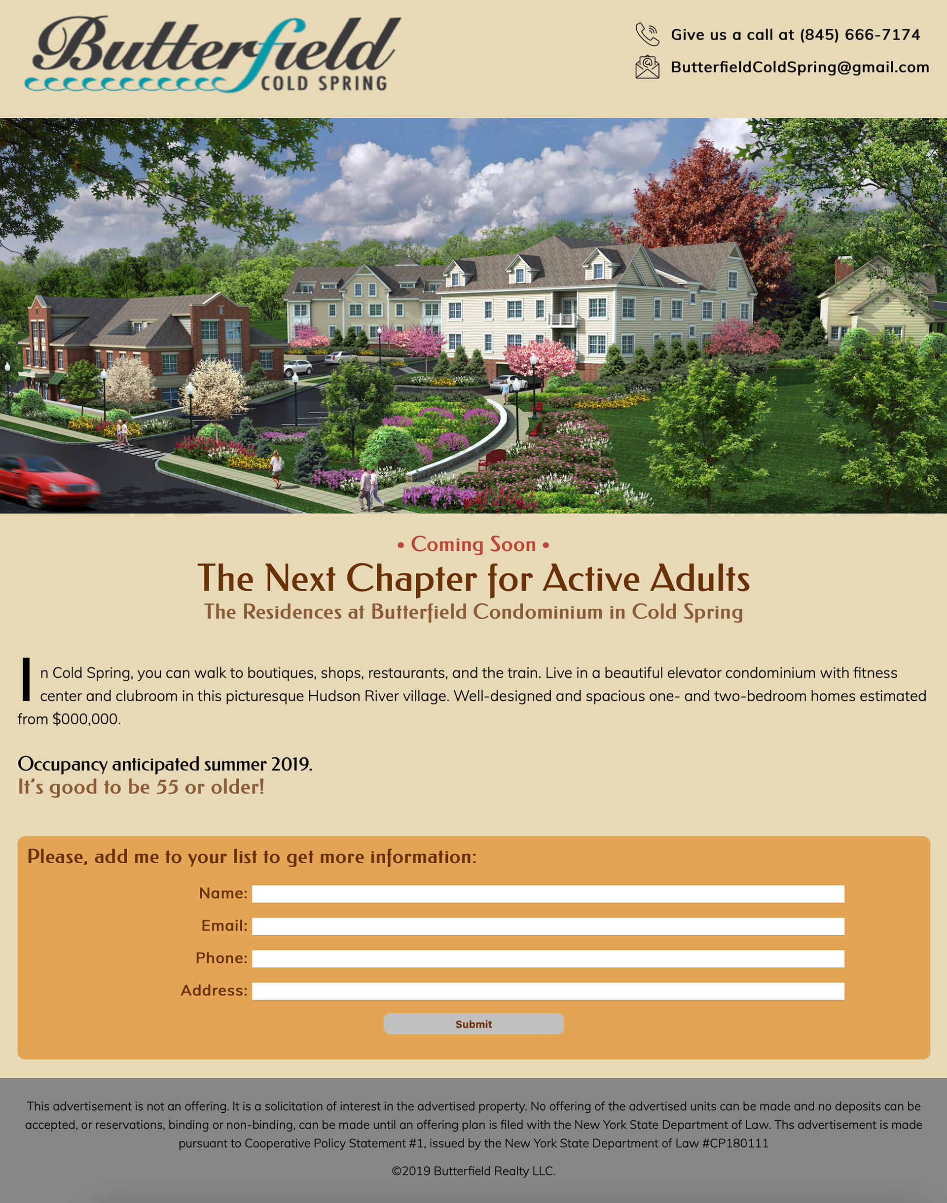
Below top right and center: Potential introductory web pages for the project, before the legal documents were available. The pages were designed to capture early interest from potential buyers.
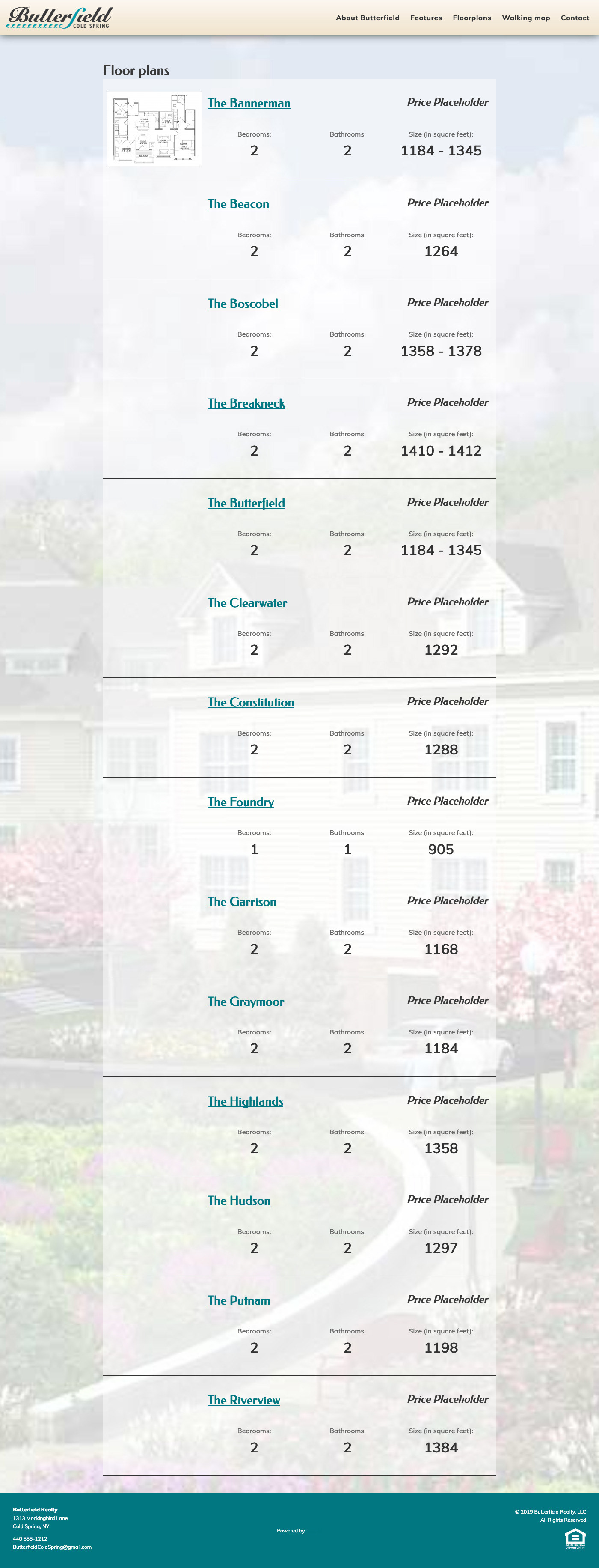
Below: The list of units allowed site visitors to get quick details and then to click the unit name for additional information.
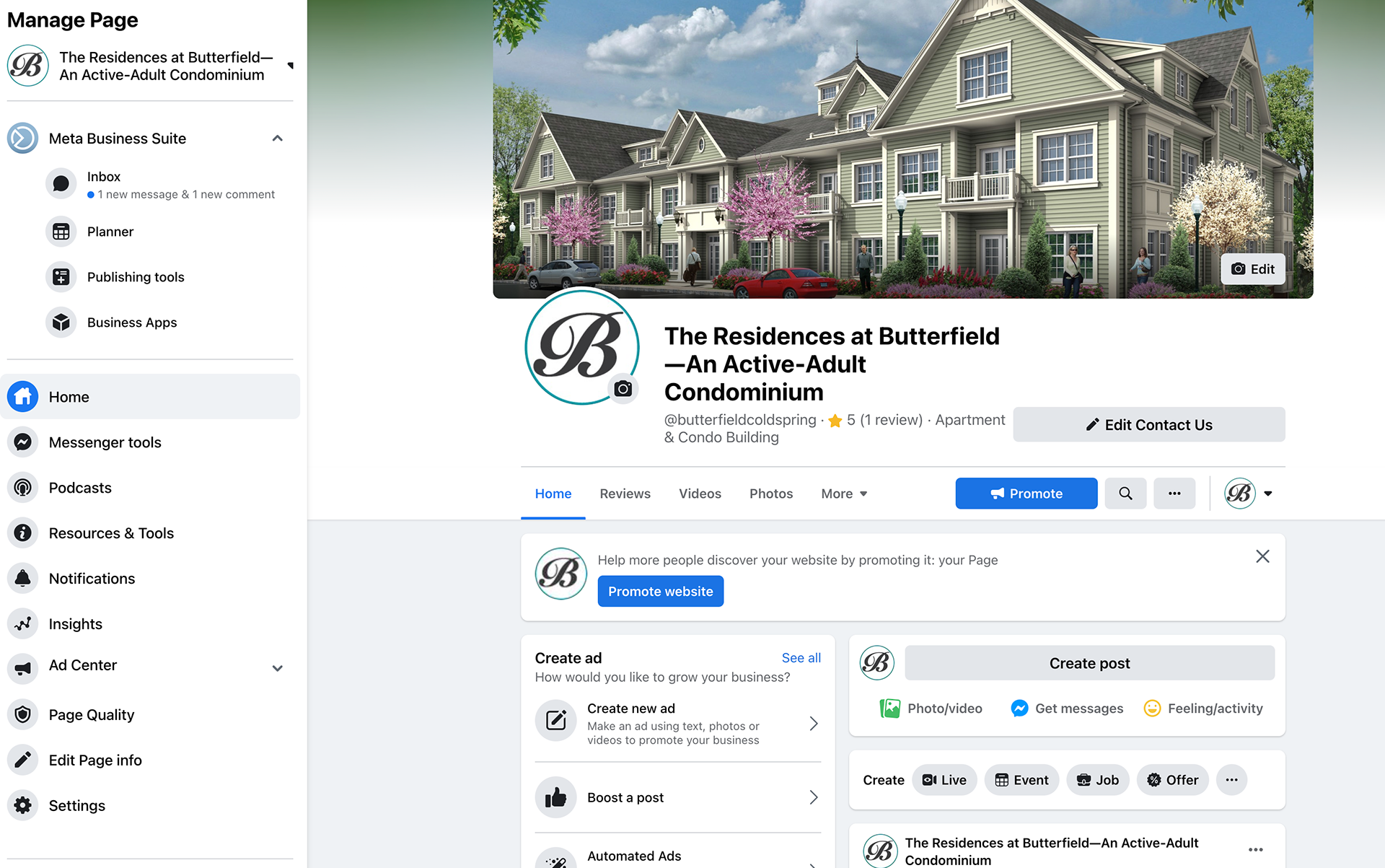
We also created a social media presence for the project, which is still active.
Email blasts (content provided by the Realtors) were sent by our team as support for the sales staff.


We also created banners of various sizes that were displayed on the fencing surrounding the building site to stir local interest.
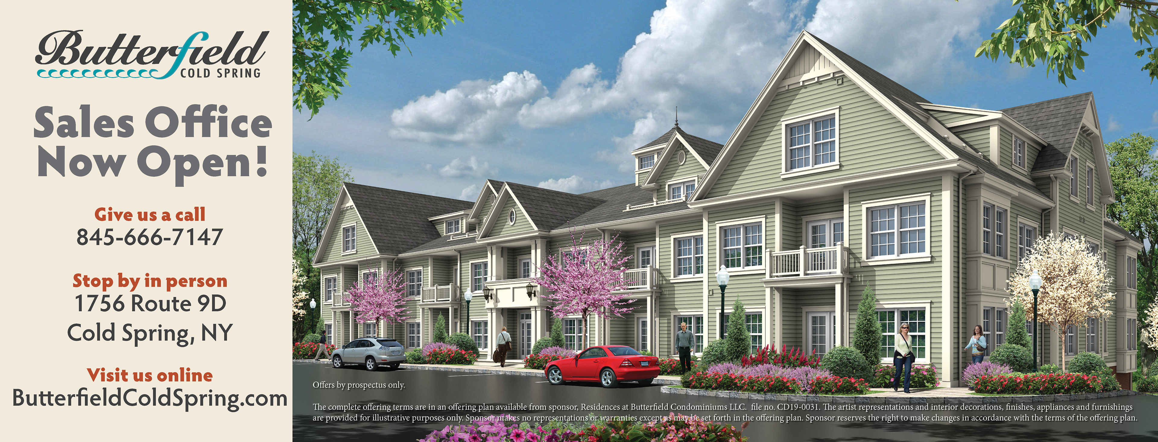
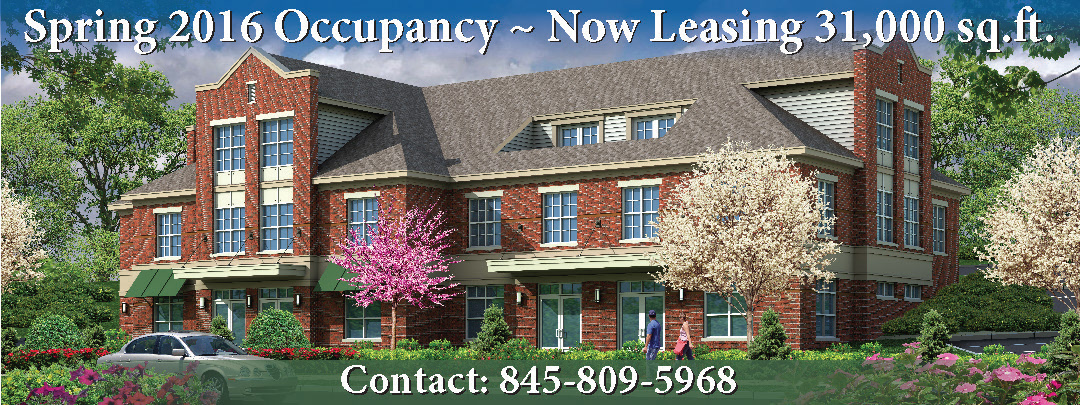
When the building project broke ground, we announced it with a direct mail campaign and flyers. For the event, we provided banners and were there taking photographs for media usage.


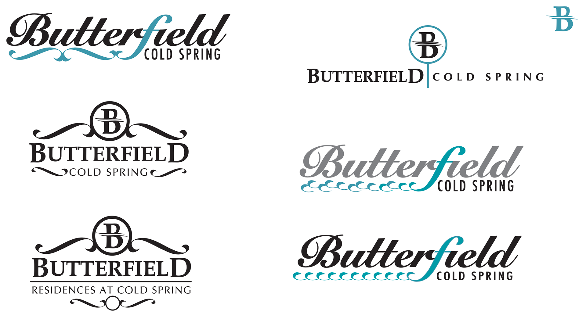
Because the Butterfield project is close to the Hudson River, we wanted to bring colors and shapes evocative of water and wind into the design. The area is also of historic significance, so using an old-fashioned font worked into our design also. All signage on the property (even for street signs for the commercial tenants) use these fonts and colors.
Initial concepts below